
How to Design a Sermon Series Graphics Package (A Real Church Breakdown)
If you want to know whether a sermon series graphics package is working, ask yourself one question: Does every piece feel like it came from the same place?
Not the same template. The same idea.
That's the difference between graphics that look consistent and ones that actually communicate something. It's hard to pull that off!
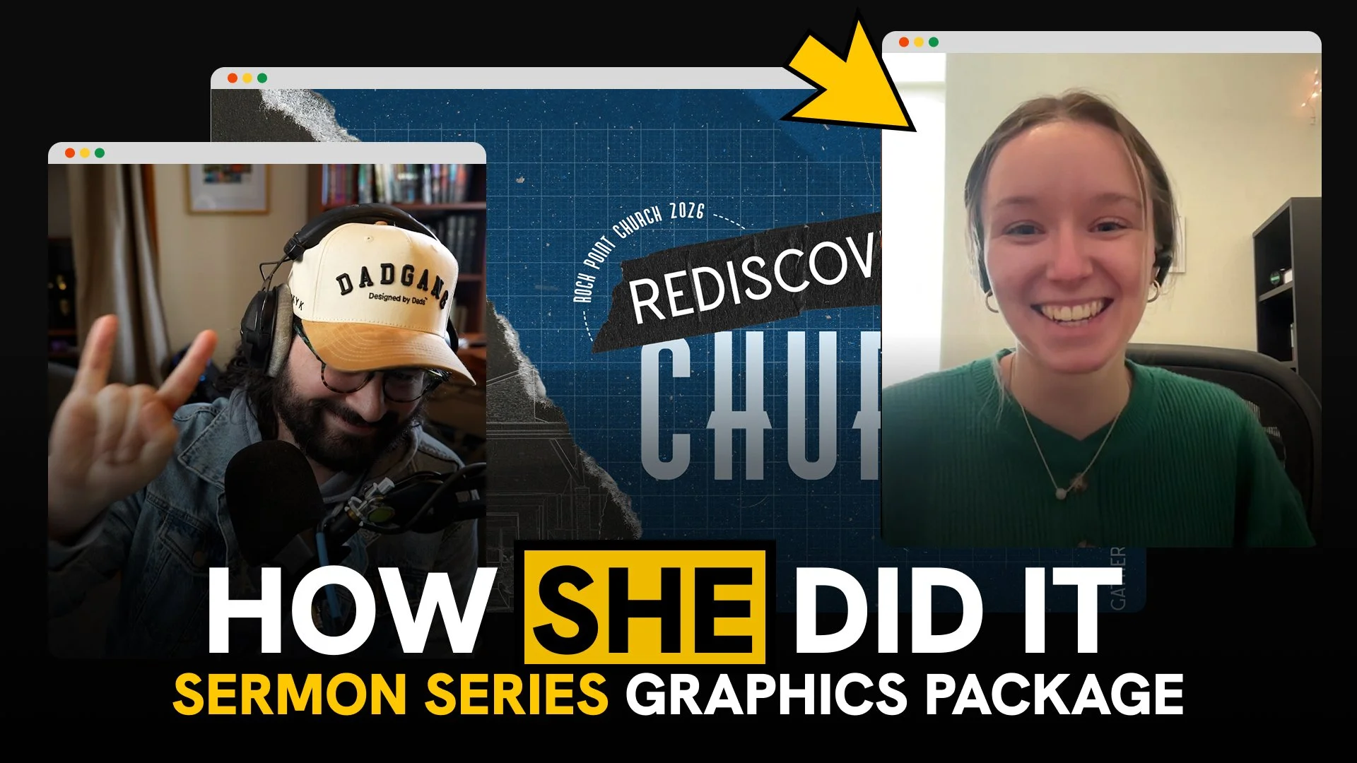
Recently I sat down with Hannah Tate, the Technical Director at Rock Point Church, to walk through her Rediscover Church series package. We went through the hero graphic, slide deck, and bumper video from concept to final file. What came out of that conversation was more than a design tutorial. It was a pretty clear picture of what separates church graphics that land from ones that just... exist.
Here's what stood out.
The concept has to connect to the message, not just the aesthetic.
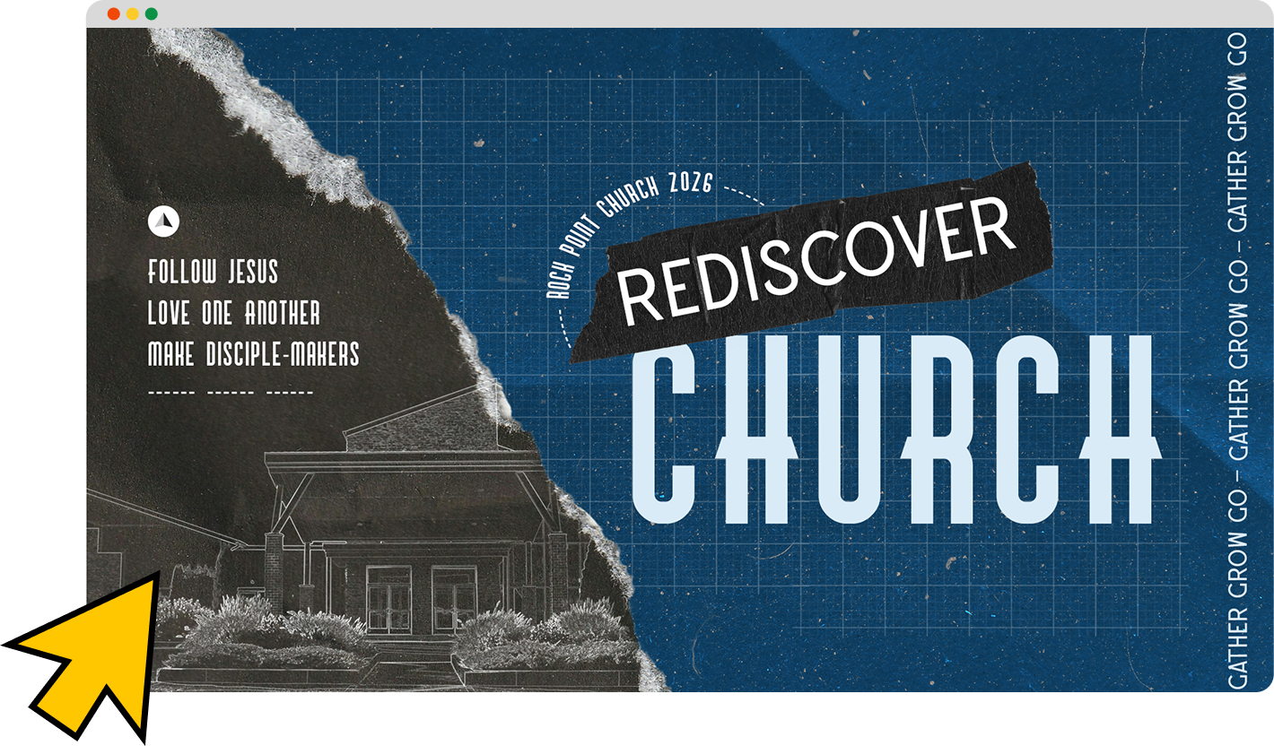
Hannah's blueprint theme wasn't chosen because blueprints look cool (though they do). It was chosen because it connected to three things at once: the series title (Rediscover Church), the church's ongoing capital campaign to build a new student building, and the theological idea of foundation: what everything else is built on. The design concept was doing theological work before anyone sat down in a chair.
That's the standard worth aiming for. If you can't explain why your visual theme connects to what your pastor is preaching, you're decorating. If you can, you're communicating.
Also, if you’ve got a good pastor who understands how creativity works with how he’s presenting the Word—your designs that decorate instead of communicate won’t even make it to the stage.
Start with the message every time.
One strong anchor, then let everything follow.
Hannah's biggest personal takeaway from this project was the value of defining one core look before opening Photoshop. She usually jumps in and figures it out as she goes — which works, but leads to packages that feel assembled rather than cohesive. This time she committed to blueprint as the one non-negotiable, and every other decision flowed from it: the grid background, the paper tear, the sketch effect on the building photo, the tape texture in the bumper.
One anchor. Everything follows. That's the discipline.
Making things feel real is a competitive advantage right now.
We spent a good chunk of the conversation on this. Paper tears, physical textures, the sketch treatment that turned a photograph of the church building into what looks like a hand-drawn technical illustration. These elements do something that flat digital design can't. People feel the difference, even if they can't articulate it. In a creative landscape increasingly flooded with AI-generated imagery, the handmade and tactile are starting to stand out in ways they haven't in years.
We’re not opposed to digital or AI at all; but we still want to value the craftsmanship of intentionally building instead of presenting empty generations.
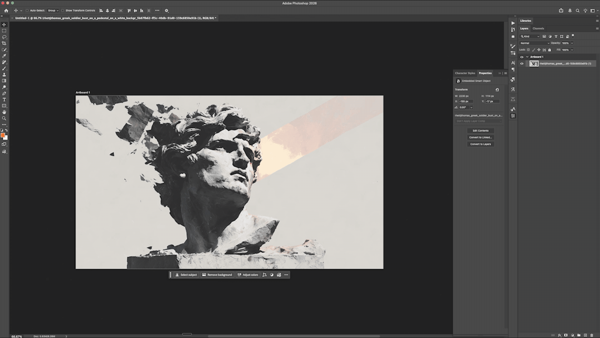
Hannah’s Photoshop trick: Desaturate → Find Edges → Invert → Levels
The Photoshop sketch technique (step by step).
This one's worth bookmarking. Here's how Hannah turned a photo of the Rock Point building into the sketch illustration in the hero graphic:
Open the photo in Photoshop
Image → Adjustments → Desaturate
Filter → Stylize → Find Edges
Image → Adjustments → Invert
Use the Pen Tool to manually trace the key outlines of the building on a new layer
The Find Edges filter gives you the ghost of a sketch. The Pen Tool gives you the clean lines on top. Together, they make something that looks intentional and hand-done. Because it partially was.
Copy Illustrator layers directly into Photoshop.
Hannah sourced the asymmetrical grid background as an Illustrator file, then copied the layers directly into Photoshop as a smart object. If you're not doing this already, it's a workflow shortcut worth adopting. It preserves scalability and significantly speeds up the process of bringing vector elements into a raster composition.
Staying inspired is part of the job.
This is the part that doesn't usually make it into a design tutorial, but it might be the most important thing Hannah said. In ministry especially, there's a temptation to treat creativity as something that just needs to get done — the mission is the point, the graphics are a means to an end, ship it and move on. And while the mission is the point, that posture slowly drains the work of the thing that makes it effective.
It shows hen you're in a healthy relationship with your leadership or client, when you have room to experiment and take creative risks, and when you're genuinely having fun with what you're building. And when you're not, that shows too. Permission to enjoy the craft isn't a distraction from the mission.
Watch the Full Breakdown on YouTube
The Rediscover Church package is a good example of what happens when all of those things align: a clear concept rooted in the message, a designer who gave herself room to experiment, and a package that feels unified because it actually was unified — from the idea on up.